10 + Hand-picked Themes in Shopify Jewelry Theme

Shopify jewelry theme offers astonishing features helping customization effortlessly to propel your products in to shopping cart regardless of the device, your customer is using to browse your site.
Customizing the product portfolio is a breeze in Shopify.
Why?
Because Shopify has readymade templates categories covering variety of industries such as Art & Photography, Clothing & Fashion , Electronics, Food & Drink, Home & Garden, Furniture, Health & Beauty, Sports & Recreation, Toys & Games and Others, all you have to do is to create a store first and load your products and go for your ecom initiative just like that!
The way we buy things has changed. Now a person no longer walks into a shop blindly (pun intentional) looking! He or she has already done research on that product and is well aware of the pricing of the product and the competitor’s price as well.
Unless you are aware of the fact that your customers are shopping online, in person, on mobile devices and with social media, you will not be fully equipped to reach out to them. Reach out to them all with one platform- Shopify!
One size fits all, no longer will work in today’s context. Are you changing how you sell?
To be successful today, you need to be able to sell your products in as many different ways as possible. In the past this was costly and complicated – Shopify makes it easy. Grow your business with sales channels. You can grow your business by adding sales channels to reach more customers. Each sales channel has its own features and an overview of how that channel is performing.
Do it all with one platform-Shopify– which is the home for your business. Easily sync orders, products and customers across all your sales channels – no matter where you sell!
Check out our selection of “10 + Hand-picked Themes in Shopify Jewelry Theme” and go for one most suitable for your needs.
1) ENZO
ENZO – Shopify Multi Purpose theme: Enzo – Responsive Multi Purpose Shopify theme. It is a trendy and great looking Shopify template and works great on mobile devices, tablets and desktop too. Theme is highly customizable with powerful admin panel, color options and product hover variations. Comes with all essential features for an ecommerce theme with complete Shopify store potential. Awesome for stores of any kinds, such as fashion, outdoor, furniture, clothing, digital gadgets, Art works etc… Sell your products effectively and uniquely. Create a Brand Image!
Responsive Design, Built with CSS 3 + HTML 5,Google Web Fonts Integration, Mega Menu Module, Sticky header, Shipping Calculator, Newsletter signup form with MailChimp, Compatible with all major modern browsers. Power Admin Panel, Color Swatches, Custom links and icons for social media, Variant Image, Multilevel Navigation, Color Swatches Ready, Custom logo, favicon upload easily, Contact form with Google map, Simply to Use & Variant Color Options in Admin Backend, Dropdown Shopping Cart, Hover Effect for Product Images, Product Reviews, Related Products, Multiple Currencies, Blog Page Design,2 Custom Contact Page layouts, SEO Optimized, Instagram widget Integrated, Signup MailChimp Popup, Unique Quick-shop feature, Ajax Add to Cart, Wishlist feature, On the collection pages choose to display 12, 24, or 48 products per page.
FAQs, Customizable front page with large slider, Twitter embed, Detailed Documentation, Video tutorials.
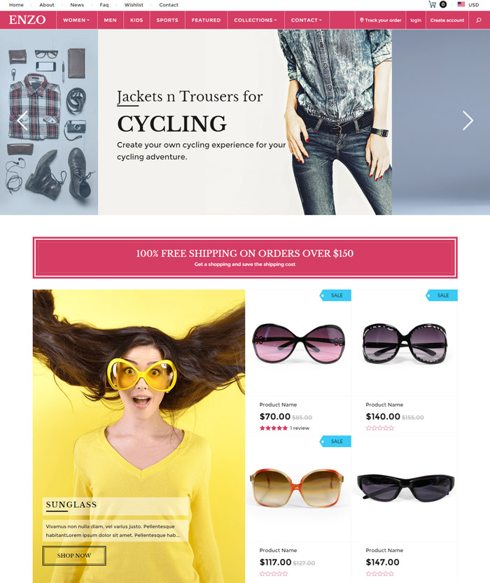
2) Mobilia
Mobilia: Sydney is favored for it’s clean and minimal style, ideally suited for boutiques to showcase beautiful products. Fresh and sleek, a minimal layout featuring exquisite typography and warm colors. See more great features here: http://bit.ly/11Po32a.
Create an Exceptional Shop: Mobilia is a beautifully responsive Shopify theme that seamlessly adapts for all screen sizes and devices. Featuring a stunning full width slideshow, highly customizable font and color settings, Quick Shop overlays, home page collections, product variant images, multi-level drop downs, product page videos and legendary customer support. Includes four exceptional styles from an award-winning design team.
The Shopify Mobila theme features a very clean and functional blog that beautifully features your news updates. You can even choose to feature the Author of each post by editing your Shopify account information!
Mobilia Theme Features: Mobilia is a beautifully responsive Shopify theme that seamlessly adapts for all screen sizes and devices. Your shop will look exceptional on Apple, Android and Windows devices at any resolution. Resize your browser to see it in action. This theme includes four styles: Tokyo, Sydney, Milan and Napa. View all four demo shops to experience the variety of theme settings.
Mobilia additional Features: Stunning full width home page slider with video support and optional captions. Highly customizable typography settings with support for Google Webfonts. Customizable background colors, font colors, and button colors. Product page gallery with optional ‘hover to zoom’ and video support. Customizable sidebar on the collection page. Built-in currency converter and newsletter popup. Associate product variants with product images. Optionally display color swatches and box-style product forms. Social media sharing on Twitter, Facebook, Pinterest, Fancy and Google+ Facebook Open Graph support for all of your products. Google Rich Snippets support for optimized product search listings. Search Engine Optimized by an industry expert. “Quick Shop” pop-ups on product collection pages. DISQUS and Gravatar support for blog comments. MailChimp newsletter support.
“Recent Blog Articles” and “Recent Tweets” support for the home page. Featured collections on the home page. Line Item Properties for adding custom fields. Shipping rates calculator. Tabbed product descriptions. Multi-level drop-down menus. Credit card icons for accepted payment methods. Social media icons for Twitter, Facebook, Google+, YouTube, Pinterest, Tumblr, Instagram, LinkedIn, and Flickr.
Shopify newsletter, contact form, and user accounts support. Legendary customer support directly from the theme designers. Your shop is viewed on screen widths ranging from 320 pixels to over 2500 pixels. These are dramatically different sizes and it’s becoming more varied with every new device. The beauty of the Mobilia theme becomes obvious when you see your shop on smart phones, tablets, and widescreen desktop browsers. It’s as if your shop was redesigned to perfectly fit that specific device.
Developed by Out of the Sandbox. Contact [email protected].
3) dEShop
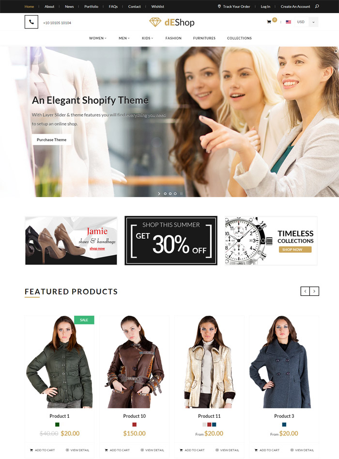
dEShop – Responsive Shopify Store Template: Modern Responsive Shopify theme; Perfect for stores of any kind, such as fashion, clothing, digital gadgets, furniture etc.,
Multipurpose design and slick look that directs attention straight to your products. The store framework is extremely versatile and easy to customize.
Features: Coded with HTML5 and CSS 3, Layer Slider Included, Ajax Cat, Wishlist & quick view, Ajax filters using tags, Manageable stylish slider section, Unique Portfolio Design, Sorting using isotope, Widgetized sidebar and footer, Newsletter signup form with MailChimp support, Custom logo, Heading bg, body bg, Mega Menu Included, Support to customer accounts and logins, Shipping Calculator, Looks good on Mobile, tablet and PC, Custom styled checkout, Custom styled member section, Google Fonts Used, Compatible with all major modern browsers, Well documented for easy setup and customization.
4) Vantage
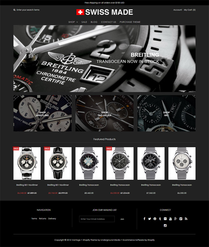
Vantage: Vantage Black is a fully responsive, highly customizable theme. Take advantage of excellent features including Google fonts, social media linking, flexible navigation options, collection page sorting, product displays, the homepage slideshow and an innovative magazine-style blog layout. Give your online store the solid foundation it needs to succeed online with Vantage Black.
Vantage is designed in an elegant way. The home page has a header menu with Shop, Sale, Blog, Contact us and Purchase theme.
Shop page in 4 column, 3 column and sidebar options. Sale page takes you directly to products arranged in 4 column layout with the option to buy. When you click on the products in this case- a watch- a beautifully created portfolio page opens with all the excerpts relevant to the product, that on clicking to view more, goes into full description of the product! Blog page by default is presented in a 3 column layout with the image on top of the post.
5) Citrus
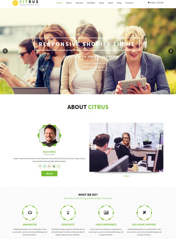
Citrus one page parallax Shopify Theme: Citrus one page parallax Shopify Theme is a beautifully designed Shopify Theme Perfect for stores of any kind, such as fashion, clothing, watches, jewels, digital gadgets, furniture etc.. This theme is beautifully crafted with hard-coded HTML 5 and CSS3 with amazing animations and parallax effect.
TEMPLATE FEATURES: Coded with HTML5 and CSS 3, Revolution Slider Included, Separate theme for single product selling, Manageable stylish slider section, Unique Portfolio Design, Beautiful Parallax Effects, Wishlist option, Widgetized sidebar, Support variant images, CSS3 Animations, Custom logo, Heading bg, body bg, Support to customer accounts and logins, Looks good on Mobile, tablet and PC, Custom styled checkout, Custom styled member section, Google Fonts Used, Compatible with all major modern browsers, Well documented for easy setup and customization. NOTE: Images used in the demo are not included for download, these images are copyrighted, if you are planning to use the photos we can provide the links to buy license.
6) Responsive
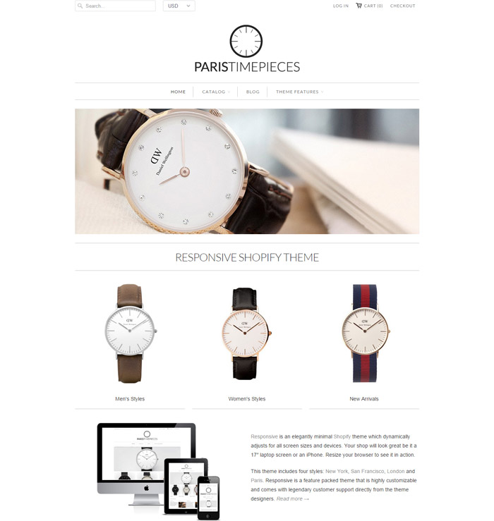
Responsive: Responsive is an elegantly minimal theme that dynamically adjusts for all screen sizes and devices. Highly customizable options for beautiful typography, drop-down menus, Quick Shop buttons, optional collection sidebar, slideshows and product page videos plus much more! Responsive is the best reviewed Shopify theme ever – http://bit.ly/12dPm63
Responsive is an elegantly minimal Shopify theme which dynamically adjusts for all screen sizes and devices. Your shop will look great be it a 17″ laptop screen or an iPhone. Resize your browser to see it in action.
This theme includes four styles: New York, San Francisco, London and Paris. Responsive is a feature packed theme that is highly customizable and comes with legendary customer support directly from the theme designers.
Features of Responsive: Responsive is an elegantly minimal Shopify theme which dynamically adjusts for all screen sizes and devices. Your shop will look great be it a 17″ laptop screen or an iPhone. Resize your browser to see it in action.
This theme includes four styles: New York, San Francisco, London and Paris. View all four demo stores to see the variety of theme settings.
Other features include: Highly customizable options for beautiful typography, sophisticated color palettes, and product layout options. All background colors, font colors, and button colors can be customized. Typefaces for headers, menus, and body text can be customized, including support for Google Webfonts.
NEW: Beautiful home page slideshow with optional captions and video support. Product page gallery with optional image zoom and video support. Built-in currency converter and newsletter popup. Instagram and Twitter home page feed. Customizable sidebar on the collection page. Associate product variants with product images. Social media sharing on Twitter, Facebook, Pinterest, Fancy and Google+ Facebook Open Graph support for all of your products. Google Rich Snippets support allows for optimized search listings of your products. Search Engine Optimized by an industry expert. “Quick Shop” buttons on product collection pages. DISQUS and Gravatar support for blog comments. MailChimp newsletter support. “Recent Blog Articles” and “Recent Tweets” widgets for the home page.
Featured collections on the home page. Line Item Properties for adding custom fields. Shipping rates calculator. ‘Back in Stock’ notification request form. Tabbed product descriptions. Multi-level drop-down menus. Credit card icons for accepted payment methods. Social media icons for Twitter, Facebook, Google+, YouTube, Pinterest, Tumblr, Instagram, LinkedIn, and Flickr. Shopify newsletter, contact form, and user accounts support. Your shop is viewed on screen widths ranging from 320 pixels to over 2500 pixels. These are dramatically different sizes and it’s becoming more varied with every new device. The beauty of the Responsive theme becomes obvious when you see your shop on smart phones, tablets, and widescreen desktop browsers. It’s as if your shop was redesigned to perfectly fit that specific environment.
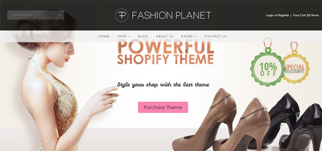
7) Fashion Planet
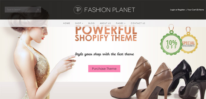
Fashion Planet Shopify Theme: Flat & Responsive Shopify Theme. Fashion Planet is a minimal, classy and modern Responsive Shopify theme Perfect for stores of any kind, such as fashion, clothing, watches, jewels, digital gadgets, furniture etc., Mainly designed to sell rich & luxurious products. Theme is written with smooth and modern HTML5 + CSS3. It looks and works great on mobile devices, tablets and computers.
Clean, professional design: The design is slick and minimal that directs attention straight to your products. The store framework is extremely versatile and easy to customize
Valid HTML,100% Responsive, Drop-down menu comes with simple and full width design, Widgetized footer, Manageable stylish slider section on homepage, Unique blog / News page design, Custom jQuery for Product Slider, Newsletter signup form with MailChimp support, SEO optimized, Adjustable color settings and background images for all aspects of the theme.
Support to customer accounts and logins, Looks good on Mobile, tablet and PC, Custom styled checkout, Custom styled member section, Full width page layout, Working Contact form, Social count in product detail, Compatible with all major modern browsers, Well documented for easy setup and customization.
8) Symmetry
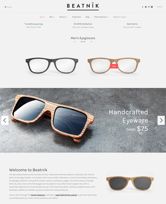
Symmetry: The Symmetry theme suite includes all 4 responsive presets; Beatnik, Chantilly, Salt Yard & Duke, for one price, including a full width slideshow, 3 homepage scrolling collection rows, grid & stream views on collection pages, Google fonts, live search, multi-level nav/menu & every row on the homepage can be placed in any order. Amazingly flexible, for desktops, tablets & mobiles + great support!
Welcome to Beatnik: The Symmetry theme suite includes all four responsive themes, Beatnik, Chantilly, Salt Yard & Duke. Amazingly flexible, it includes a full screen width slideshow, 3 rows of scrollable collections, homepage collection row, grid & stream views on collection pages, the entire library of Google fonts, & every row on the homepage can be placed in any order! Great support too, with a dedicated website full of information & tips. This theme has been carefully crafted to work with desktops, tablets & mobiles, so you’re covered for every audience.
Have a look through the theme features, and take a peek behind the scenes to see how Symmetry could help boost your look, online presence and sales!
One of the most flexible features of Symmetry is the ability to switch of the full width mode. If you would like to fix the width of your site and not have the slider edge to edge with the browser and would like your homepage content to fit to a column width, you can do so with one click. Pretty neat if we do say so ourselves!
How frustrating is it when you can’t re-order your content simply!? With Symmetry you can simply move your content rows to wherever you like. Fancy the a slider half way down the page? Fancy your collections row at the very top, no problem. Finally you can order your content to target your customers simply and easily.
An awesome feature of Symmetry is the Quick Buy (Google style) Detailed Dropdowns. These are features on all product images on the homepage and collection pages, allowing your customers to add items to the cart from anywhere on the site maximizing your conversion rates.
9) Sigma
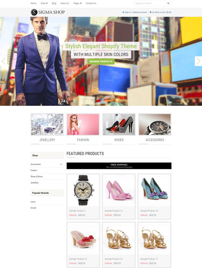
Sigma | Responsive Multipurpose Shopify Theme: Sigma is a premium Shopify theme packed full of great features. Sigma comes packed with next-generation features and flexible theme customization settings and easy to setup. Featuring support for high-res product images, responsive layout for widescreen and mobile devices, quick shop option, dedicated sidebar, product videos and much more…Sigma features subcategories in the sidebar, navigation dropdowns, social media integration, customer accounts, SEO features and more!
Clean, professional design with four color schemes, Valid HTML5 + CSS3, 100% Responsive Theme, Quick Shop Option, Embed Product Video, Custom pop up screen to engage visitors, Manageable stylish slider section on homepage, Unique blog / News page design, Custom jQuery for Product Slider Pop up, Newsletter signup form with mail chimp support, SEO optimized, Adjustable color settings and background images for all aspects of the theme, Support to customer accounts and logins, Looks good on Mobile, tablet and PC, Custom styled checkout, Full width page layout, Working Contact form, Social count in product detail and blog, Compatible with all major modern browsers, Well documented for easy setup and customization.
10) District
District: Thoughtfully designed, District Theme was created to be highly customizable for any style without complexity. District features a highly customizable homepage, mobile friendly slider, email marketing and Instagram integration. The fully responsive Shopify theme looks stellar on mobile, tablet and desktop devices.
An Overview of District Theme’s Settings: Thoughtfully designed, District Theme was created to be highly customizable for any style without complexity. District features a highly customizable homepage, mobile friendly slider, email marketing and Instagram integration. The fully responsive Shopify theme looks stellar on mobile, tablet and desktop devices.
Presets: District comes with three style presets to help you jumpstart customizing your Shopify store. Clicking on one of the presets will automatically apply the style’s color scheme, typography (fonts), and layout variations.
Neutral, white and light grey color scheme with condensed sans titles. The demo is set up as a men’s fashion store selling tee-shirts, hats, bags and office products. Colors
Set the primary text, accent, and background colors throughout the site. If you need some inspiration, try browsing the theme presets.
Some optional theme features like the Homepage Slider and Email Offer Banner include color settings in those section.
11) Atlantic
Atlantic: Atlantic combines our love of refined typography and framing with massive organization, including a multi-tiered navigation menu, homepage slideshow, and tons of space for featured content. It’s flexible, user-friendly and stunning. Learn more about Atlantic’s features here: http://pxu.co/1uizOSn
Theme Features: Atlantic combines our love of refined typography and framing with massive organization, including a multi-tiered navigation menu, homepage slideshow, and tons of space for featured content. Loaded with four distinct, handcrafted presets, it’s flexible, user-friendly, and stunning. Pick it up today.
Responsive Design: Your store will be consistent on every screen size – phone, tablet, or television. Search Engine Optimized, Each page is immaculately engineered and optimized for search engines (SEO). Completely Brandable, Customize headers, colors and fonts. Upload a logo and make the theme your own. Built-In Presets, Target your industry with four different look and feel presets: Minimal, Modern, Chic & Organic.
Browser Compatibility: All our themes are built to work on modern browsers and tested to look perfect.
Retina-Compatible: Every theme asset comes at full resolution and is entirely scalable. Free Upgrades. We continue developing and supporting our themes as long as you keep using them. Quick Shop, Display product information and add to cart without leaving the catalog. Mega-Navigation, Help customers find products faster with a navigation focused on user experience. Complete documentation for Atlantic can be found here, World-Class ,Customer Support, Our support staff is committed to helping you solve any problems you encounter along the way. Exceptional, human support matters to us a great deal. Contact us or check our help centre if you need help with anything at all.
12) Watches
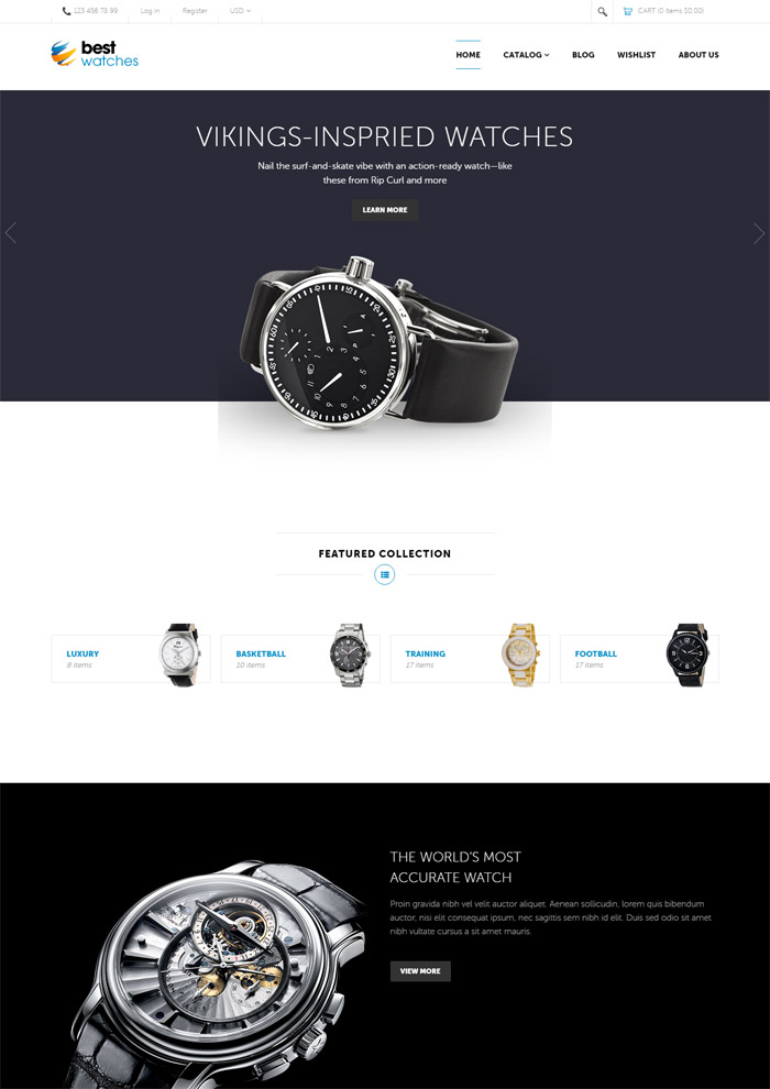
Watches – Responsive Shopify Template: Theme Details: Fully Responsive Shopify Best Watches Theme is a special one. Firstly, Best Watches was mixed and incorporated perfectly sliders, skins, float headers and float top bar, to give the whole theme a smooth sense. Best Watches has Full Width Slide containing special and the new products. Secondly, we bring you wonderful technologies as Foundation, Owl Carousel, Front Awesome and Animation.
Moreover, with Canvas Menu and Product Hover make your menu display powerful and flexible. Besides, we provide Ajax- Add To Cart. With Grid and List Mode, your product be shown 2 types and to access using Quick View. Lastly, Powerful Config helps you easily customize your website. Fully Responsive Shopify Best Watches theme is the ultimate combination with differences in modules with wonderful features as Swipe. Animations can be display perfectly in all devices. Let’s run your online store with our Best Watches. Wish You Success with Best Watches!